Mid-Century is a popular design aesthetic that is characterized by a few very distinct shapes, colors, and features. The idea of mid-century modern is derived from architecture, furniture, colors, and even graphic design that hit peak popularity between 1933 and 1965. You may be able to identify it when you see it, but learning the elements that make up mid-century design will help you incorporate as much, or as little, of this style into your spaces as you’d like.
Walk the Line

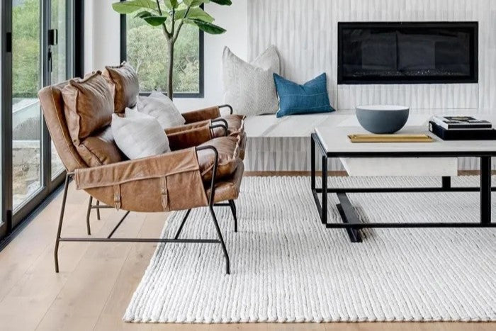
Mid-century design is characterized by very distinct lines. Mid-century lines are curved but very clean. Traditional tabletops become curved (think tulip tables) and the legs famously angle out in mid-century design. Mid-century couches use long, sleek lines with curved edges to create a very low, compact look — especially compared to traditional couches which have much more body, sit higher off the ground, and don’t use long back lines.
You can add elements of mid-century modern style to your home by incorporating these sleek, curved, and very graphic lines into your furniture, your wall art, or even the textiles in your room like pillows and rugs.
Make it Minimal

You probably guessed it, but mid-century design is pretty minimal. The minimalism of this design style comes because of the rise in industrialism in the United States in the middle 1900s and was affected by the world wars as well. As a society, people were innovating and cutting the clutter of their parents’ design style, which also played a large part in making mid-century minimal.
If you’re designing a mid-century-inspired space, remember that less is more. Chose strong mid-century objects and furniture to fill the room and don’t worry about plastering the walls with art or decor. When possible, let the architecture of the room work as a focal point and contribute to the overall mid-century feel of the room.
Out of the Woods

Another key element to mid-century design is the combination of natural and man-made elements. This means lots of darker woods are used in the home in interesting ways (like wall and ceiling features) and there are lots of houseplants in homes and mid-century spaces. It’s about the seamless marriage of man and nature in design. Mid-century design also mixes in other natural elements with unconventional man-made materials. In a mid-century home, you are very likely to find a combination of glass, wood, vinyl, marble, rock, metal, and plastic. Allowing all of these elements to stand on their own, but work together, is what makes a mid-century space pop.
If you’re worried about mixing in all of these elements in your home, start with just one or two natural elements and one or two man-made elements. Then, slowly layer in decor made with midcentury shapes and other elements that you might be missing in your home. Try adding a glass mid-century vase to a wood tulip table or setting a metal box atop a marble countertop.
Shelf Yourself
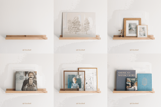
Open shelving is a fun element to add to a mid-century home and if you want mid-century floating shelves go dark with your wood type. While white oak floating shelves are really popular today, that wasn’t the case back when mid-century design was forming. Mid-century design is characterized by darker wood tones, so mid-century floating shelves are darker-toned wood. You can use a dark mid-century stain on your floating shelves or use wood like walnut, cherry, or stained alder.
Adding mid-century custom floating shelves to your house can be a fun way to display mid-century trinkets and design items. Remember not to overfill your shelves though. Keeping your shelf decor minimal will make your shelves feel very on-brand.
Set the Tone

Mid-century design uses muted tones with pops of color. While you can get creative here, remember that mid-century design is characterized by warm tones when you’re selecting the muted base you want throughout your space. Once you nail down the muted tones you want to use throughout your home, select the perfect pops of color. Traditional mid-century colors include mustard yellow, orange, teal, and varying shades of green. You’ll want to do a little research on specific shades and tones before you add these colors to your home so you select a mid-century shade of the colors you select, not a traditional or modern shade.
Funky Town

Mid-century designs often also incorporate an element of funk. Whether that element is architectural or an added piece of decor, there is something surprising and fresh about good mid-century design. While original mid-century design definitely incorporates these funky elements into the architecture, don’t feel like you need to build a full feature wall (though that would be really cool) to achieve the look. As with any design style, there are a lot of different ways to go about creating a look in a particular style.
Inspiration Strikes

The great thing about design is that you can combine lots of different styles and aesthetics, so no matter how much of a mid-century touch you want to add to your home, there is a way to make it happen. If you’re feeling stuck about what elements to add to your home, start by looking around online or watching a rerun of The Brady Bunch or Mad Men to get a taste for mid-century elements. Sometimes furniture listed online as mid-century isn’t actually mid-century, so remember to look for those classic mid-century shapes and design-tells so you can add authenticity to your space.
Elevate your space with Ultrashelf's custom floating shelves—where elegance meets functionality. Tailor your surroundings to your style with our unmatched customization, precision, and quality.


